By: Michael Emanuel
Date: May 22, 2026
This blog title sounds a bit crazy, but it’s the truth. My client contacted me regarding a website re-design project for their nonprofit agency in late April. Normally, I ask for the usual details: organizational information, the current website link, inspirational websites, assets, branding, etc. TLDR, the existing website was bare, and the organizational details were a little sparse. Here’s what I worked with:
· A program flyer
· Cellphone pictures
Now that might not sound promising, but there’s a lot you can glean from even a little information. To my client’s pleasant surprise, they received a transformed website that captured everything they needed to get back online. And we got it all done in two weeks. Let’s delve into this case study.
As I said, there wasn’t a lot of material to go off initially. I was provided with a flyer that contained the core idea of what the organization was about and their goal. This is a nonprofit organization that wants to train young children in various aspects of the marine industry so they can be prepared to work in that field. Based on that, I was able to glean a few things:
1. The marine industry is the main focus of this program
2. Training is the method of service delivery
3. The target audience is young children in middle school up to high school
4. The main website function needs to be enrollment
5. This organization is a nonprofit that likely requires donations to provide this service
Identifying these key points determines the focus of the website content:
· Keyword(s) – Since this is a vocational program focusing on the marine industry, utilizing keywords like “marine vocational program” or “marine training program” will tailor all website content around specific search intent
· Education/Training theme – Vocational programs follow a general pattern of training a specific group in certain fields, usually with the outcome of certification. Structuring the website content based on program curriculum, timelines for completion, certifications, and job opportunities makes sense here
· Child-focused – This program being catered to children means the website content should create a feeling of fun, safety, and opportunity for them – as well as the parents that will be enrolling them.
With these guiding principles, the content developed succinctly and effectively captured all key aspects of the program. I’ll show the screenshots of the developed content in the final section.
The flyer that I mentioned earlier actually provided the full color palette for the organization (navy blue, light blue, yellow, and white). Given the nature of this organization and the target audience, that palette was perfect. The color balance consisted of:
· Light blue as the primary color for large sections, navigation, and footers
· Navy blue for key information and headers
· Yellow for a call-to-action button or section
White isn’t usually regarded as a color in a palette, but it’s quite important. Wherever possible, I made sure to preserve as much white space as possible to keep the website bright and de-cluttered.
There wasn’t a specified font, however so I needed to experiment with dozens of fonts to find the right fit. I ultimately settled on Ofelia Display, a geometric sans-serif font. For those that don’t speak graphic or web design lingo, a sans-serif font is one that is casual and mimics typical handwriting. The geometric aspect just means that the font is based on typical shapes like circles, squares, and triangles. This font was chosen because it had just the right balance of professionalism and child-friendliness, while also being wavy enough to mimic the marine theme.
I’ll be showing screenshots of the old homepage design and comparing them to the new design in this section. I will also offer critiques that I made on the old design and discuss how the new design addresses them.
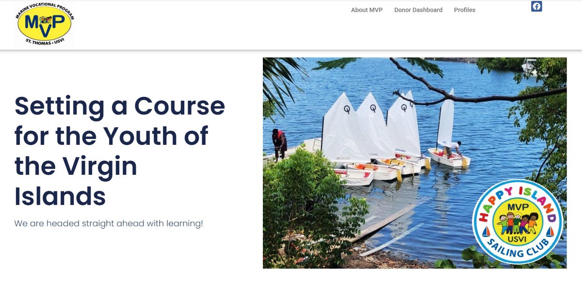
This is the hero section of the old website home page. Here are my critiques:
· Content – There isn’t enough information presented in this hero section to tell people what this website is about. This site could be about sailing, education, or anything water related. There’s also no clear call to action in this section, so people don’t know what to do.
· Design – The hero section isn’t bad from a design standpoint. It is a very simple layout with a lot of white space, however it’s not very visually engaging.
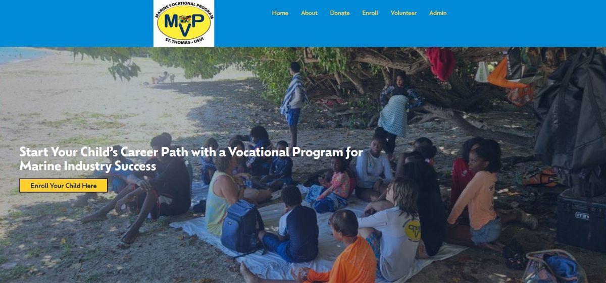
This redesign features the branding, has a clear message about what the website is about, a clear call to action, and also contains a picture of the students in one of their training sessions.
.jpg)
This section discusses the mission of the organization. Here are the critiques:
· Content: This isn’t so much a mission as it is a program description. Also, giving this much detail on the homepage is likely to make visitors scroll past this section. It would be better to shorten this to one or two sentences and provide a link to a separate page with more information.
· Design: The design here is bland. There’s nothing visually engaging about this section, which makes it even harder for people to interact with the information

This redesign shortens the messaging of the mission to one sentence that focuses on what the organization strives to achieve. Further, it contains a link to more information, so people have the option to browse if they want to without cluttering the home page. Lastly, this section continues to showcase the branding.
.jpg)
This is the About Us section of the old website. Here are my critiques:
· Content – This is a little duplicative of the Mission section because it touches on some of the same information mentioned there. It also talks about giving donations, which isn’t appropriate in this section. However, it does a good job by giving some historical information about the organization.
· Design – The pictures featuring the students in their training is a nice touch, however there isn’t much else to say about this section.
.jpg)
.jpg)
.jpg)
These three screenshots are an expansion and re-design of the About Us section. These sections explain the program curriculum, requirements for entry, the training process, the schedule, and certifications that children earn. The organizational information is not included here, because it is already briefly captured in the re-designed Mission section and you can read more on the About page. From a design perspective, much whitespace is preserved, however the color palette is used to draw attention to key information and calls-to-action.
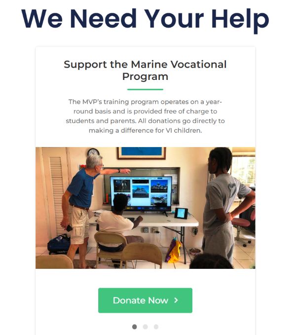
This screenshot is the donation section. Here are the critiques:
· Content – The messaging here is fine, though it could go into a little more detail about the nonprofit status of the organization.
· Design – There isn’t much to critique here, however the image choice is a little questionable. We don’t really know what we’re looking at in this picture.
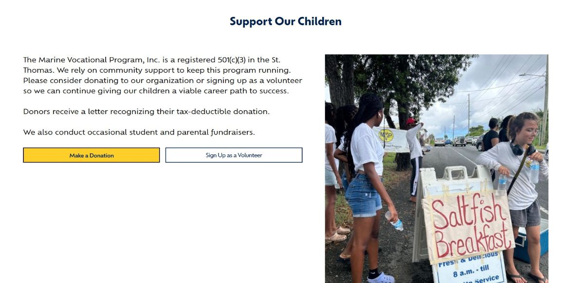
This is the re-designed donation section. The revamped messaging discusses the nonprofit status of the organization and the reliance on community support to provide services. There are also options for contributions – either providing a financial donation or volunteering to teach students. The image shown clearly demonstrates students and volunteers of the program raising funds for their continued learning. Lastly, the header changes the intent of the message to supporting the students rather than the organization.
I won’t get into all the details of the other pages since this article is long enough. However, the previous website only contained 2pages (home page and about us) and the re-designed website expanded this footprint to 5 pages (home page, about us, admin, volunteer, and enrollment). Most notably, the website now features an online application for student enrollment and volunteer sign up, which modernizes the existing paper-only approach.
Search Engine Optimization (SEO) improvements largely consisted of making the website mobile friendly, reducing page bloat (i.e., compressing image size, minimizing CSS and Javascript, etc.), and making use of relevant keywords. Since the site launched on May 10th, there have already been 45 new users who have spent an average of 3.75 minutes on the website. So far, 374 events (e.g., page clicks, views, submissions, etc.) have been carried out on the website.
.jpg)
This project shows that you can take a small amount of information and turn it into a well-designed, optimized website. You can view their website at this link so you can see it for yourself: www.mvpvi.org.
If you want me to make an amazing website that represents your brand and performs well, check out my information below.

.png)